Ortus Rebranding Project


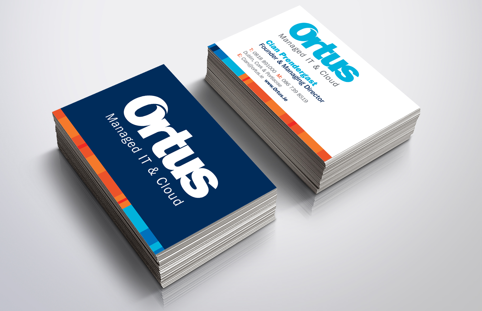
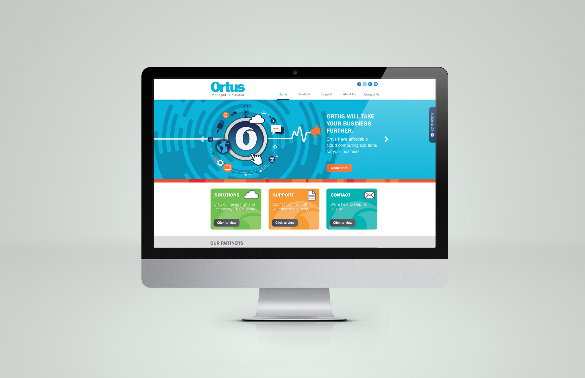
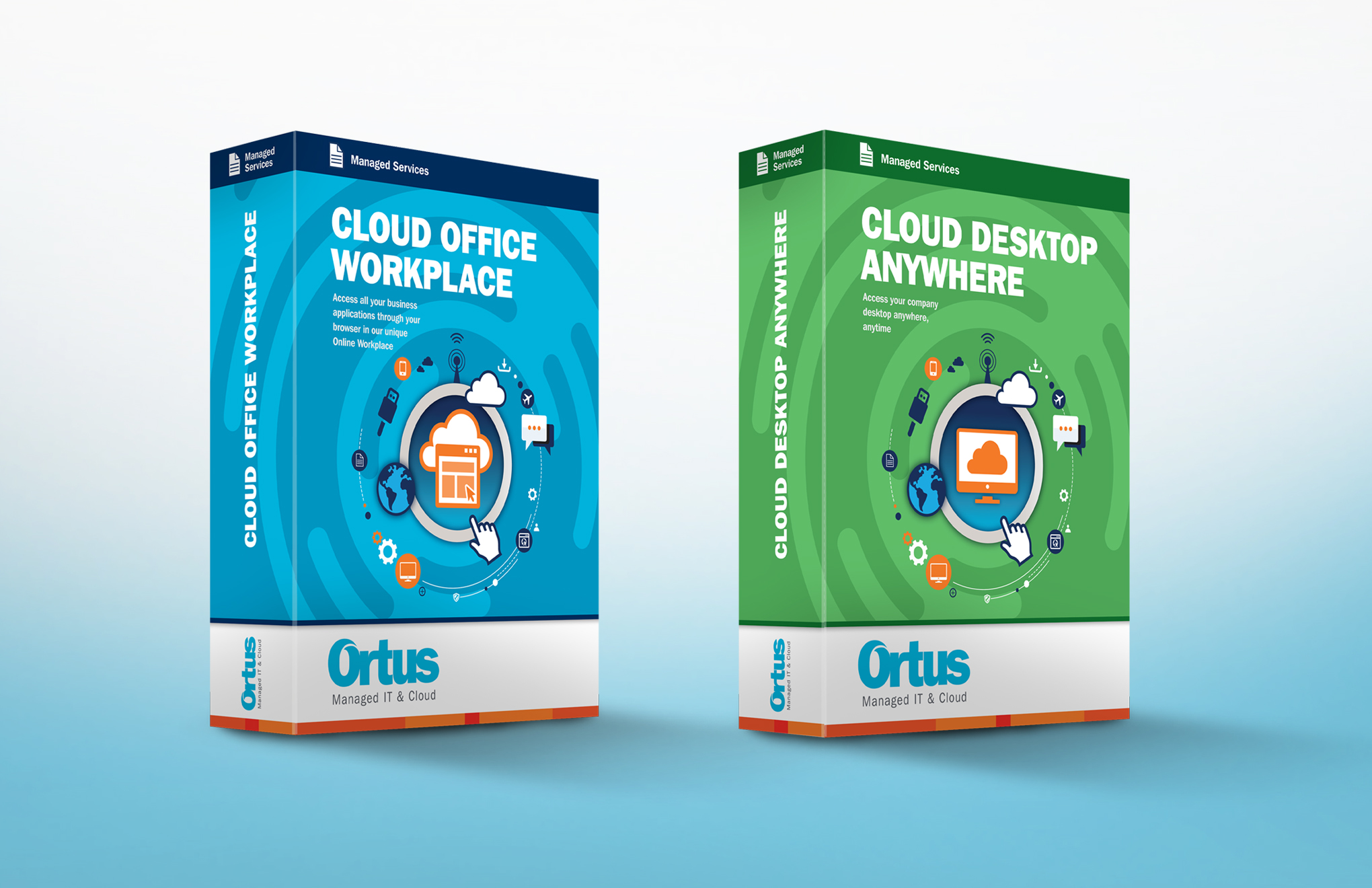
Earlier this year we worked on a rebranding of Ortus, an Irish IT company specialising in cloud, infrastructure and security services. The brief was to update the pre-existing logo to a stronger, more streamlined identity that could visually compete with their more widely known contemporaries.

Ortus means ‘source’ in Latin. Taking this as inspiration for our design, we used a bold sans sans serif typeface and elegantly removed a small sliver from the ‘O’, giving a visual sense of movement, circular motion and the concept of a ‘source’. Ortus now had a new identity that could work clearly across all applications and platforms – from printed brochures and stationary, to websites and even mobile phone apps.


Ortus app

We rolled out this new branding to the stationary – letterheads, compliment slips and business cards. Along the bottom of each we applied a vibrant orange strip to compliment and lift the minimalist identity. We then brought the new branding forward into the re-design of their website, as we also simplified the old website’s sitemap and content architecture, improving navigation and usability.

Ortus business cards

Ortus desktop

Ortus product boxes

We also created a custom ‘Connectivity’ illustration featuring the Ortus app icon at the centre, with various cloud and IT icons spinning around, re-enforcing the visual concept of Ortus being the “source” for all IT services. This was used in the new website and as the basis of the design for product boxes which Ortus were developing to help sell their premium and standard suites of services.

Ortus nomadic stand

Finally, we produced a large format display stand for use as a backdrop at conferences. The main selling point was: “99.95% Uptime – Or Your Money Back”. We took an aspirational route, and developed a graphic of a handglider taking to the skies, to visually re-enforce the main message of reliability, support and uptime, as well as a sense of excitement and adventure.