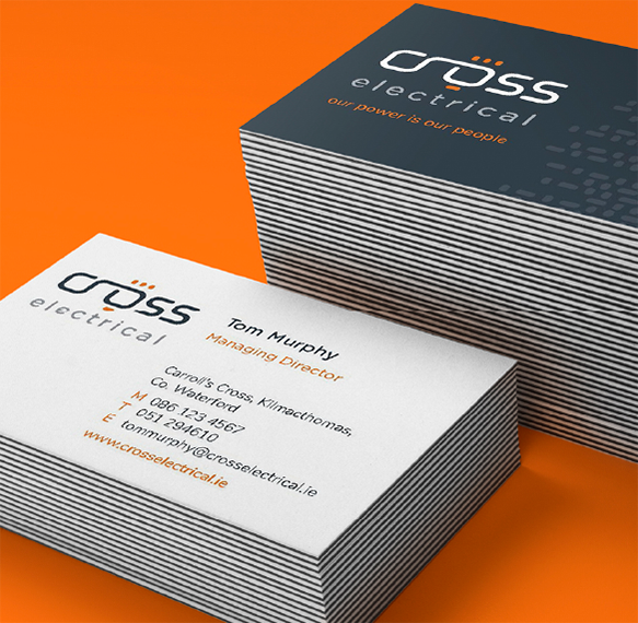
Lighting It Up

Cross Electrical

Cross Electrical were a company with an exceptional track record, who’d been going through massive growth driven largely by word of mouth referrals and repeat business from high-end clients. But they had no professional branding or website in place to support pro-active sales and needed us to develop a new brand identity for them.


Simplify

We started by trying to understand what made them unique versus their competitors and what they valued. We interviewed the Cross Electrical team, listening to their perspective and we looked from the outside in, with industry and competitor analyses. And then we simplified – we distilled all that down until we could clearly define their key USP and brand values.


Cross Electrical business cards
worker

Create

Once we had clarity on what the essence of Cross Electrical’s brand was, we focused on crafting a tagline – and the consumer facing statement that best summed up their brand was “Our power is our people”. We then redesigned their logo using a custom designed typeface that reflected precision, flow and connectivity as it curved from the ‘cr’ through the lit up “o” – using grey, the colour of intellect and wisdom. We developed an authentic and engaging tone of voice and used this to craft the copy for the website. And we created a powerful visual identity, with custom photography from Denis Vahey, which was brought to life across a new responsive and professional website.


Empower

We equipped this exceptional company with a brand and the tools they needed to compete at international level for new business and continue to scale at pace. We provided them with an engaging and dierentiating professional logo, a tone of voice and a bank of high quality, professionally branded images to ensure they could communicate their brand consistently across all touch points, now and into the future. We also provided them with CMS (content management system) access and training so they can continue to update the case studies and content online, to ensure their brand remains relevant.


worker
worker
worker
worker
worker
worker
worker
worker