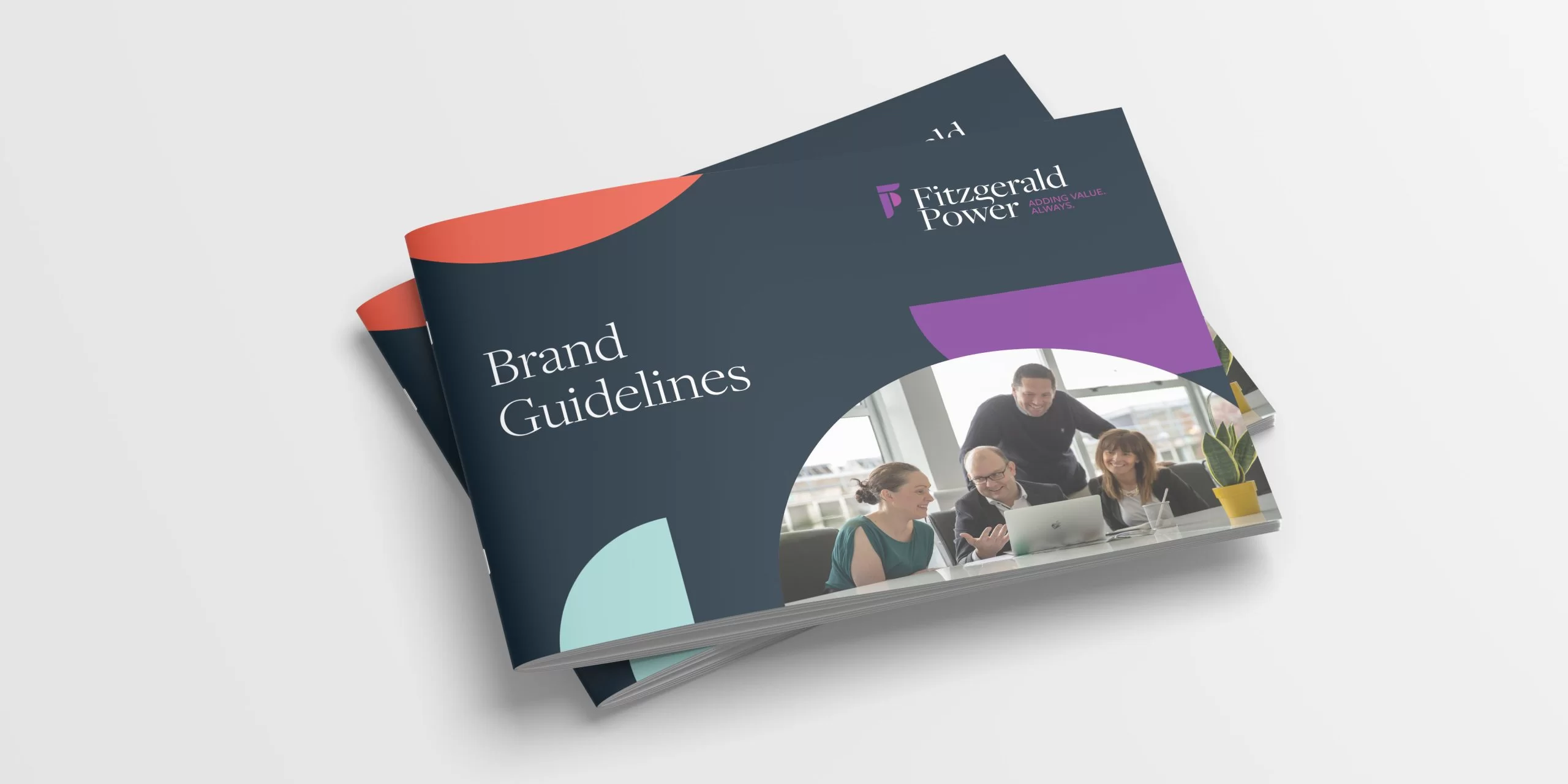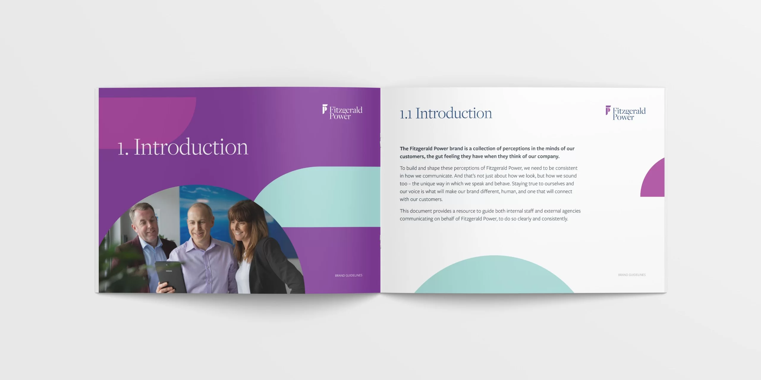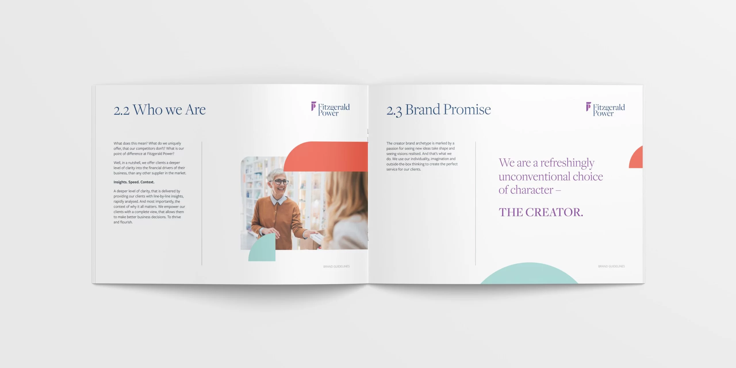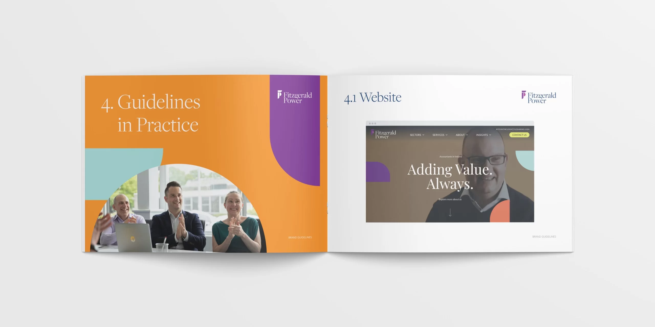
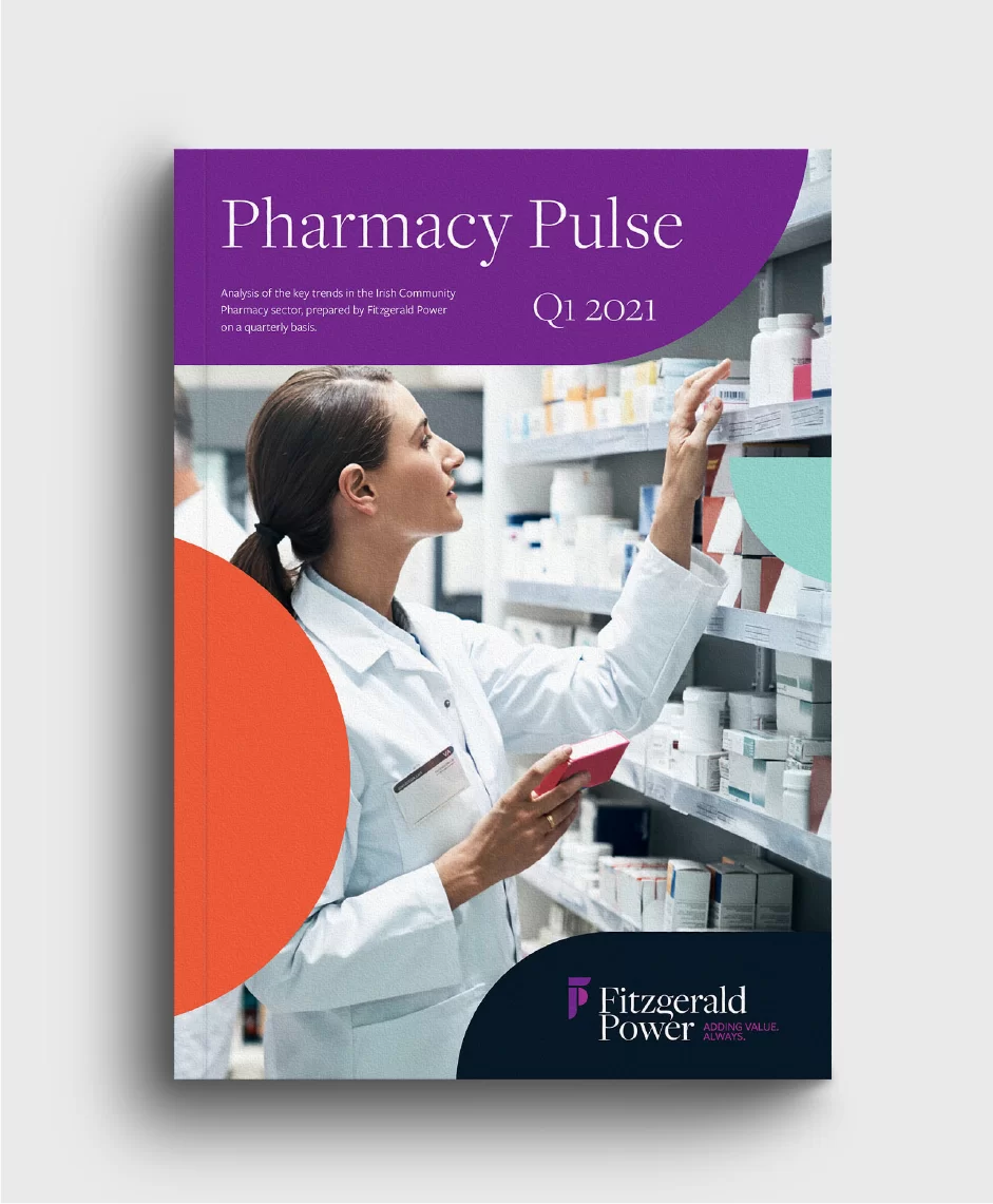
Fitzgerald Power’s brand is based on three core strengths: insight, speed and context. The unrivalled depth and speed of their analysis yields detailed information which they carefully contextualise and tailor, offering clients a clear and comprehensive view of their business that enables them to grow.
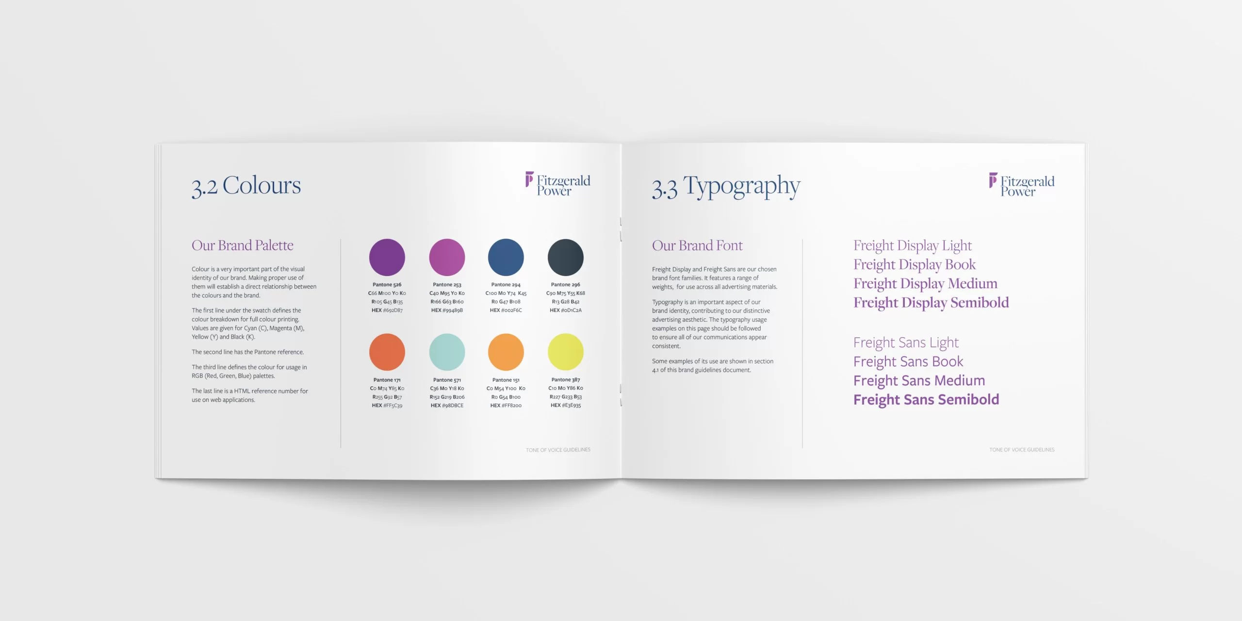
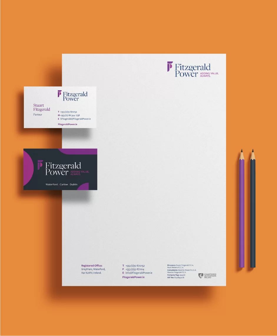
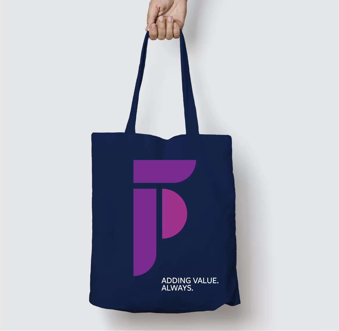
TOTEM’s design expresses this unique identity. Using a vibrant palette of pink, purple and navy, we created a contemporary monogram in which three distinct shapes – reflecting the core strengths – combine to form the FP initials. These shapes are used across all applications – in various colours and sizes – to help bring Fitzgerald Power’s creative personality and outside-the-box thinking to life. The monogram is balanced with a refined serif typeface (Freight Display) that expresses Fitzgerald Power’s unparalleled expertise, knowledge and professionalism.
These elements, along with a compelling brand story and the strong tagline, combine to great effect on an easy-to-navigate website that communicates Fitzgerald Power’s ability to empower their clients with a complete view that allows them to make better business decisions.

Honor Byrne, Director of Sales and Marketing