Simplify
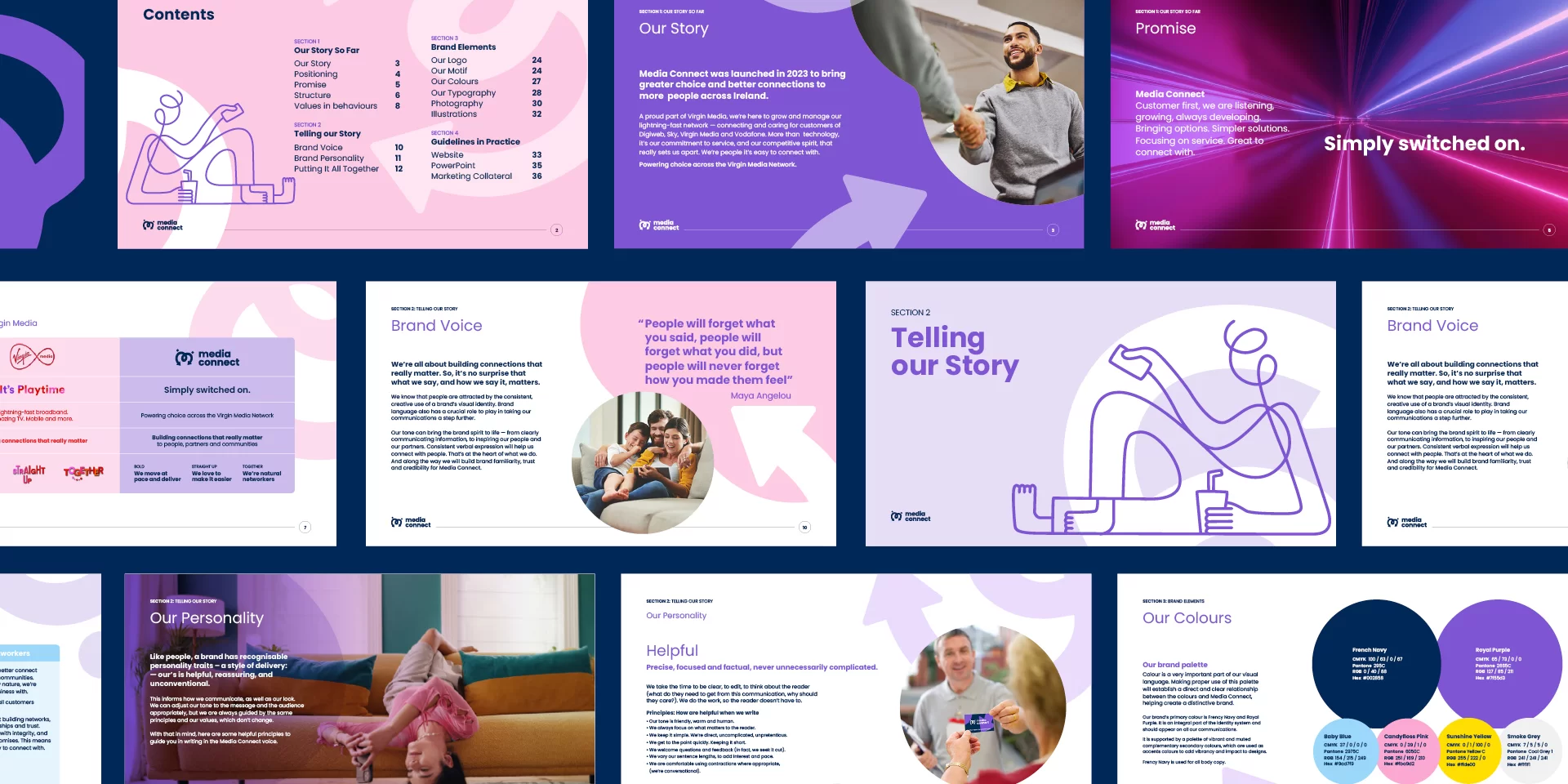
TOTEM engaged with the stakeholders to develop a strategic foundation that acknowledged this heritage. Building the operating principles on Virgin Media’s core values – Bold, Straight Up, and Together – we created continuity and clarity to help our people transition. While we established a distinct character and voice for Media Connect, every element builds on the proud culture of enterprise and service in the parent company.
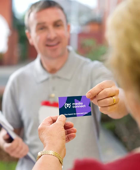
Engaging with customers, our research identified strengths. Positive perceptions of the network and performance. And strong customer ratings for service delivery. ‘People it's easy to connect with’ – the new positioning – emphasises what makes the Media Connect team special: commitment to service at pace, reliability, and relationships. Focusing on people rather than technology helps humanise the transition for both the people that works with us and retail partners.
Engaging with customers, our research identified strengths. Positive perceptions of the network and performance. And strong customer ratings for service delivery. ‘People it's easy to connect with’ – the new positioning – emphasises what makes the Media Connect team special: commitment to service at pace, reliability, and relationships. Focusing on people rather than technology helps humanise the transition for both the people that works with us and retail partners.