However, it’s not as straightforward as certain colours matching certain traits. We know red is connected to excitement, love and youth; and that yellow denotes playfulness, optimism and warmth. While green implies nature, growth and wealth; blue is all about being calming, trustworthy and strong; and purple about wisdom, and luxury. Although we do need to understand the emotional connections and connotations to colour, the persuasive role it plays is much more complex. And in regards to design and branding, it’s key to address appropriateness and differentiation.
Appropriateness - reflect your brand's personality
To define a brand’s identity, the colour used needs to be appropriate for its personality. Whether it’s red, yellow, green or blue; whatever colour is chosen should fit the brand’s character and the product being sold.
A 2006 study explored the role that colour can play in the building of brand meaning, showing that it’s more appropriate for functional products to be presented in functional colours, and sensory/social products in sensory/social colours. The study, The Interactive Effects of Colours and Products on Perceptions of Brand Logo Appropriateness also examined the ability of colour to enhance a brand’s desired image. When people know how brands are attempting to position themselves, they consider colours that match with those positions to be more appropriate.
For example, one of the most popular colours used in marketing is red. It is utilised across a variety of products – Red Bull for energy, CNN for action, and Colgate for strength. The colour also has connections to danger and passion. So rather than focusing on the often highly personalised response colour can evoke, with appropriateness the importance is placed on how the colour can be used to reflect the brand’s personality.
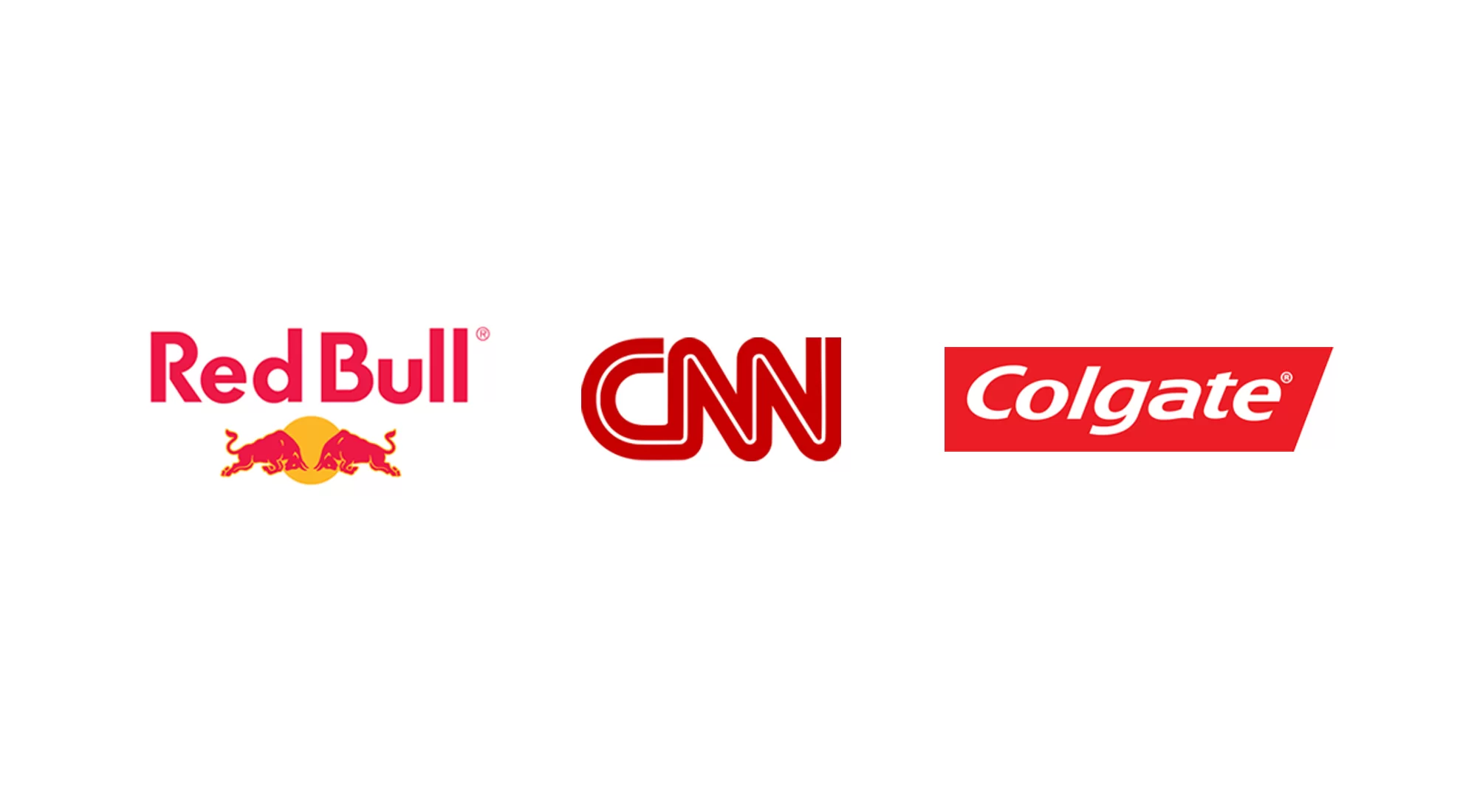
These logos show the use of the colour red to reflect different personality traits – Red Bull for energy, CNN for action, and Colgate for strength.
A prime example of colour suitability between a brand and its personality is Facebook. If wanting to purely evoke an emotional response from users, then Mark Zuckerberg could have used red to conjure up excitement, or yellow to activate feelings of hope and warmth. However, neither would have reflected the true personality of the brand, which is all about being engaging, distinctive and safe. The colour blue represents all three. Although it’s widely documented that Zuckerberg is red-green colour blind, hence his choice of blue, the psychology of colour was certainly still carefully considered.
TOTEM created this identity for Ortus, an Irish IT company, using blue and grey to portray their personality traits of trust, reliability and security, and positioning them as a credible IT expert.
Differentiation - helping you stand out
While it’s key to find the right colour that works for your brand, the importance of setting yourself apart from competitors is also vital. The colour of well-known brands are so ingrained in our consciousness, that when you think of yellow arches only one brand springs to mind. In a similar vein, Pepsi wouldn’t work as red while Coca Cola couldn’t be blue. Yahoo couldn’t be multi-coloured nor Google purple. The protective nature that companies can have for their chosen colour is most evident with Cadbury, who lost their legal fight in 2013 to stop other chocolate companies using its trademark purple.
As colour defines brands and used for recall and their identification, savvy marketers must look at how they can stand out from the crowd. And in this bid to differentiate, it is also possible to defy conventional colour associations, like the green of Starbucks. Originally the coffee chain had a brown logo, a colour that certainly communicates coffee. However, it’s also a colour used by a number of other shops supplying that all important caffeine hit. That dramatic move from brown to green not only differentiated Starbucks from other coffee suppliers, and challenged colour associations; it also meant the brand adapted a universally popular colour, favoured by both men and women. Also, could the reason the coffeehouse chain is so well-known to be an epicentre for creative folk be in part down to the colour’s links with creativity? German researchers found that a brief glimpse of green, dubbed “the green effect”, prior to a creativity task enhanced creative performance. (It seems that while Kermit the Frog may sing “it’s not easy bein’ green“, things aren’t all that bad for the colour!)
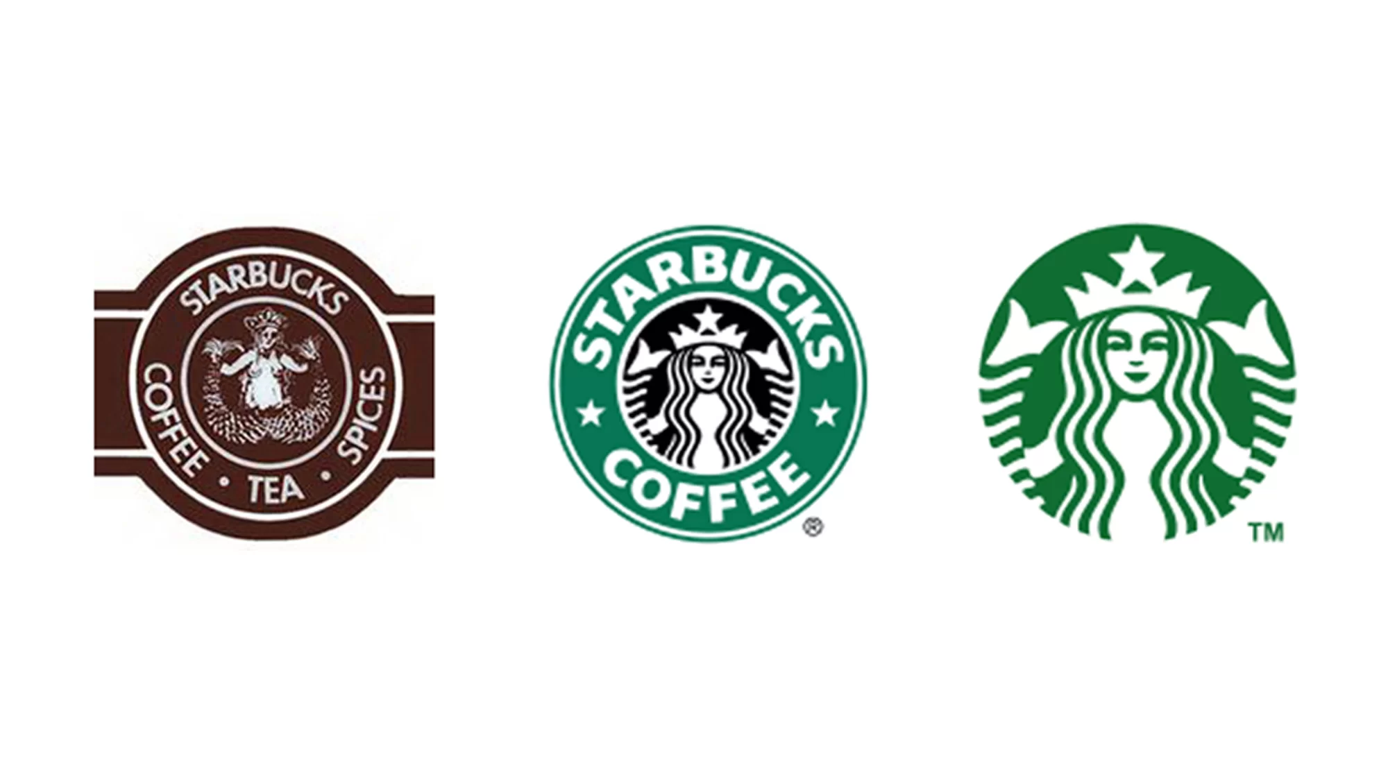
Starbucks moved from brown to green to differentiate Starbucks from other coffee suppliers; it was also a universally popular colour, favoured by both men and women.
Hence, choosing the perfect colour for a brand should not be underestimated. When selected well, they can develop a relationship with a customer or client in an instant, define a brand’s value, reflect personality and ethos, and create a desire for a product and trust in a service. Colours are significant, and once the intricacies of their psychology – from emotional attributes to appropriateness to differentiation – are figured out, it’s possible to find that perfect shade… one that paints a brand it its best light.

TOTEM created HKM’s new identity where a colour palette of silver and aqua blue was used to differentiate the company as well as convey a mature and reliable personality that is innovative.
We specialise in helping brands like you shift the dial for what you stand for in the heart and minds of your customers.
