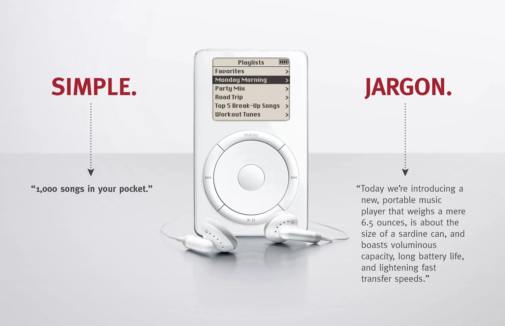
Simplicity is better. It just is!
“Today we’re introducing a new, portable music player that weights a mere 6.5 ounces….”
The jargon description above is true. They were all unique selling points of a new and innovative device – the first iPod. But it was technical. And complex. And most of all it forced you, the reader, the potential customer, to do all the work. You had to read all that information. Try and understand it. And then wrap your head around the real question – so what?
People are busy. You get bombarded with all sorts of messaging and images every day. Your attention span is interrupted constantly. You don’t have time to do the work for brands. If they want you to notice them. To listen. And to act. They need to do that hard thinking behind the scenes and present you with a simple, inspiring and bold reason why you should care… because we’re going to put 1,000 songs in your pocket.
It's not something most of us are trained to do. To start simplifying your message, means forgetting everything you learned in school.
“I wandered lonely as a cloud”
What a beautiful line! One that you may well remember writing an essay about. Were you rewarded for the thousands of words you wrote about ‘pathetic fallacy’ and how Wordsworth used this kind of personification of an inanimate object of nature to portray the powerful human emotion of loneliness?
Yip! In academics, we’re all taught to discuss, elaborate and add. To take something simple and complicate it. The fancier the words, the more obscure the observations, the better. And that is useful and important – in education. But it is the exact opposite of what you need to do for your brand.
You’re starting at the other end. You have all the complex information, insights and internal corporate jargon of what you do. What you need to do is whittle it back. And back. And back again… to the simplest, most emotive and concise point you could make.
You need to take that thousand-word essay and create the single line.
It takes hard work and asking a lot of questions.
“Out of clutter. Find simplicity.”
The journey to simplicity involves asking one question, a lot – why? Anyone who has young children will know, while this sounds easy, it’s not. It can be exhausting! But it’s worth it. Because to answer that question, you’ve to consider all the information and distil it down to the key point. It leaves no room for waffling. Keep asking why. And when you think you’ve reached the end, ask why one more time.
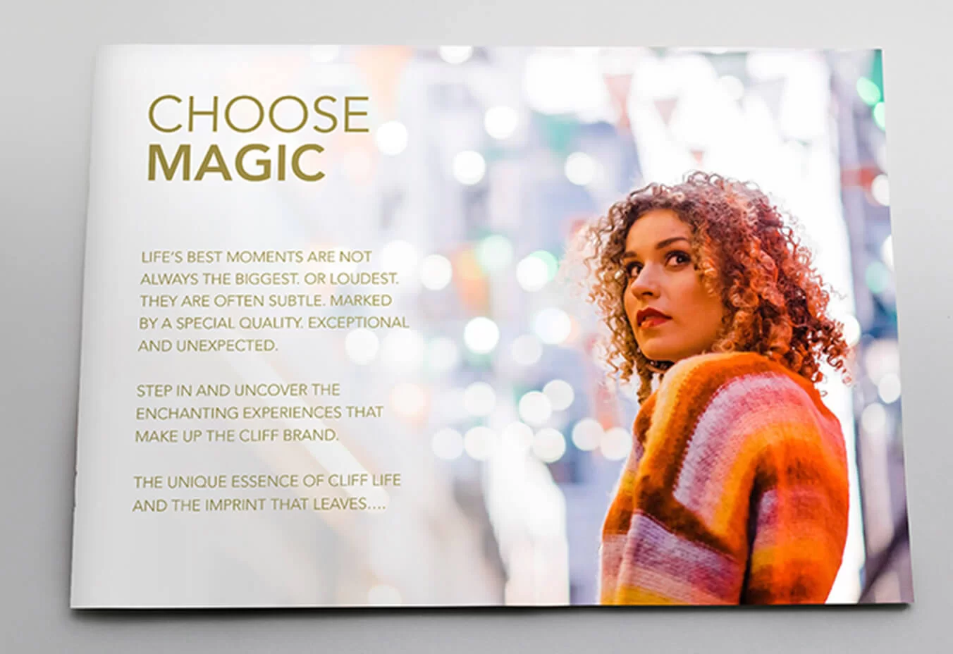
We recently partnered with CLIFF, a capsule collection of privately-owned venues including The Cliff House Hotel, Cliff at Lyons and Cliff Townhouse, to refresh and reposition their brand. They needed a new visual and verbal tone of voice and a website design that would bring the CLIFF brand to life. Our job was to showcase the unique imprint the CLIFF brand leaves on those lucky to encounter it.
And so we asked a multitude of ‘whys?’ in order to understand what it is that’s so special about CLIFF.
Why choose CLIFF?
The answer – because CLIFF is a collection of exceptional and enchanting experiences celebrating Irish culture, heritage and gastronomy.
So we asked – why does that matter?
Because CLIFF is a mark of quality. We aim to create and leave our guests with vivid memories of unexpected delight.
And finally, why is that important?
To stand apart and be unique we think differently and do things a little differently too. At CLIFF we seamlessly combine imagination and innovation, an adventurous spirit with an eye for detail whilst adding a little magic along the way.
And that’s how our key headline emerged. When you choose CLIFF, you “CHOOSE MAGIC”. Armed with these two words, we developed a unique new visual and verbal tone of voice.
It sometimes mean taking up more space not less.
“Everything should be made as simple as possible… but not simpler.”
Simplicity doesn’t have to mean shorter. Sometimes your audience need more than a tagline. Whether it’s an information brochure or an annual report… your collateral may need to deliver more than one message.
Just remember, one message at a time.
Don’t try and cram all that information into a few pages. Give your information room to breathe. On each page you’re presenting, simplify and prioritise the key message you’re trying to communicate. And don’t be afraid of white space. It’s not dead space!
You want your key message to pop. Strong visual presentation and headlines that communicate the main point, means that a reader can just skim read and in a few minutes, understand the essence of what each page is about. It allows them to easily navigate to the detail they’re interested in.

It takes a little touch of genius in the background.
“Any intelligent fool can make things bigger, more complex. It takes a touch of genius to move in the opposite direction.”
One big challenge with simplifying your messaging is that you may need multiple messages for different audiences. Traditionally that meant ignoring some audiences and prioritising who you spoke to, or trying to be all things to all people and complicating your message.
Cork Chamber had recently gone through a strategy process that redefined their focus and ambitions for the future. But they now needed to evolve their brand to reflect this. They wanted to inspire a new sense of magnetism and relevance for the Chamber. And create a more engaged membership base. One where every member could feel like they belonged.
Our first step was to create a brand manifesto. This is your declaration to your audience, to the world, that doesn’t just say who you are – it shows who you are. The key is that it evokes emotion. It connects with readers. And people don’t just understand who your organisation is and where it’s going – they feel it!
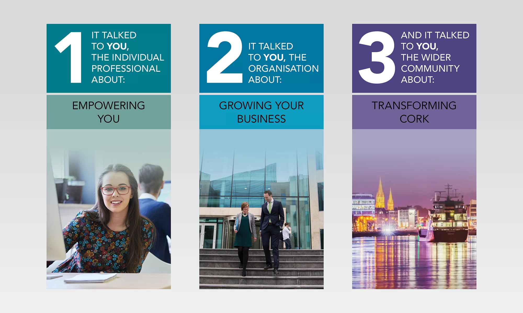
For Cork Chamber this involved the creation of an empowering statement that put YOU at the centre of everything they were doing…

This manifesto was more than just a simple declaration of intent. It established the new tone of voice for Cork Chamber – the voice of a dynamic business champion. It created the structure and framework for how they would tell their story.
But Cork Chamber are doing so much from policy and lobbying, to events and training, to attracting investment and helping Cork companies to go global – we couldn’t tell everyone everything at the same time.
So next we needed some way to organise and priorities Cork Chamber’s most important messages – a hierarchy. And what could have been a very difficult process, was made easy – it was simplified as it all flowed naturally from the Brand Manifesto.
The Manifesto talked to YOU! But it talked to three very different YOU’s who needed three different messages:
And you need one last ingredient - courage!
Simplicity’s arch nemesis is FEAR.
After doing all that work to simplify your message to a simple statement or a striking visual, at the last-minute fear can set in.
Why? We’ve found that there are two key reasons:
- Fear that you’ve got it wrong. That people won’t get it and understand it. And it can be so hard to resist the urge to add in extra lines to explain nuances or extra messages to broaden the appeal.
- Fear that you’ll be seen as less. That you’ve oversimplified and will be seen as light, or somehow unprofessional. That you’ve put less work in.
And when these fears set in, extra detail are like a security blanket… you may think what’s the harm in adding in an extra line? One extra graph? One more slide? But each addition adds more clutter that your audience needs to wade through.
Simplicity isn’t just complicated. It’s scary. But be brave and push through it. Because simplicity works. It cuts through the noise. And it will help you instantly connect with your audience.
