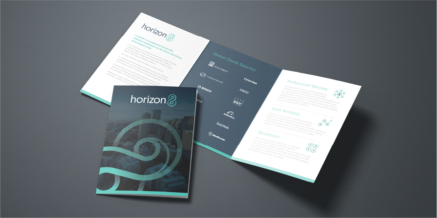
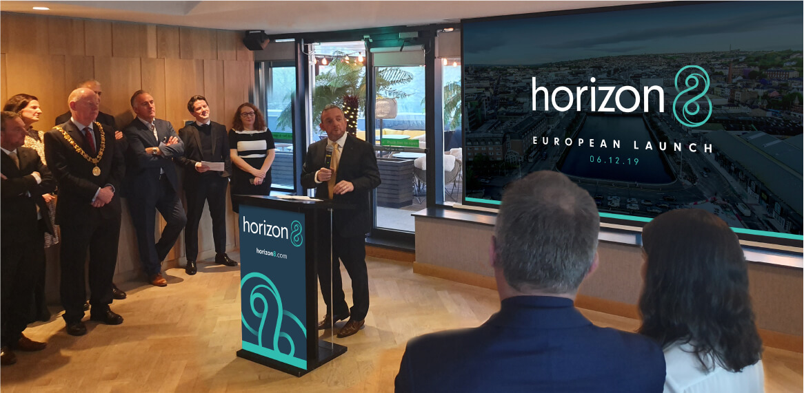
Endless Possibilities

Horizon8

Working with a global financial technology company with a base in Asia and looking to expand into Europe and the US, we developed a new name and brand identity for them. Retaining the essence and values of the original sister brand was key to its success.


Simplify

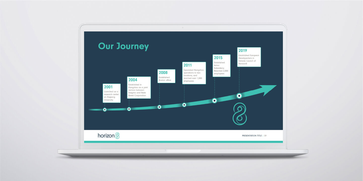
HengTian is an innovative technology company, which was founded in 2004 as a partnership between Boston based State Street, Hangzhou based Insigma Technology and Zhejiang University. Growth in the Chinese market was strong with an impressive global client list. They were now expanding into Europe and the US and appointed TOTEM to develop a new name and identity for these markets. Our first step was to facilitate a brainstorm briefing meeting with key personnel – to understand HengTian’s unique proposition and history, to clarify the challenges for the existing brand and define what the new brand name and identity needed to communicate to prospective clients.


Horizon8 laptop
Horizon8 laptop
Horizon8 laptop
Horizon8 laptop
Horizon8 laptop
Horizon8 laptop
Horizon8 laptop
Horizon8 laptop
Horizon8 laptop
Horizon8 laptop
Horizon8 laptop
Horizon8 laptop

Create

We took away a clear brief from our session with HengTian and started our own internal creative brainstorm. We knew the name needed to be easy to pronounce, have an available .com domain and communicate the infinite possibilities their innovative technology solutions could provide. But they were also immensely proud of their Chinese roots and it was that history and proven track record, that would form the cornerstone to building trust and credibility in these new markets.

And so, the name Horizon8 emerged – inspired by the current name which directly translates as infinite horizons, with the figure 8 as a symbol of that infinity


Horizon8 brochures
Horizon8 brochures
Horizon8
Horizon8
Horizon8
Horizon8
Horizon8 image
Horizon8 image

Empower

With this new name, came the creation of a new brand identity. A logo was developed featuring a monogram of the figure 8 which forms part of the company name. The symbol loops infinitely around on itself, with an inner line to give added uniqueness, movement and depth to the graphic. It was paired with an all lowercase sans serif font which anchors the swirling 8. A teal green was chosen to complement the corporate navy and dierentiate it from competitor colour schemes.

Finally, we empowered the team with a suite of launch communication creatives to allow them to unveil this powerful new Horizon8 brand identity with a splash. And we set them up to move forward in these new global markets with confidence.


Horizon8 European Launch
Horizon8 image
Horizon8 image