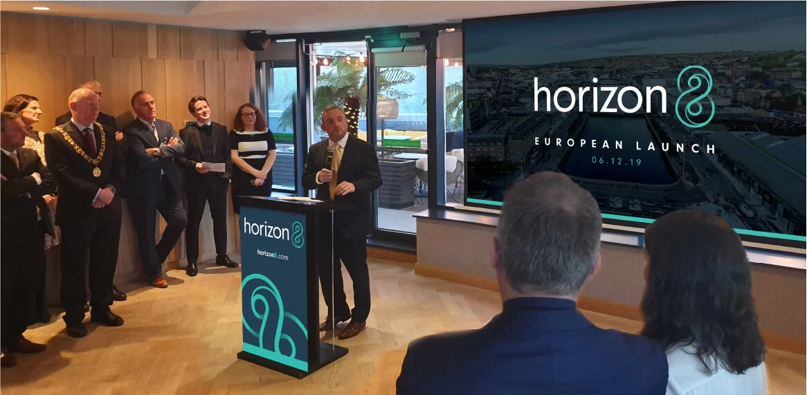
Endless Possibilities

Horizon8

HengTian is a US-Chinese technology enterprise, founded as a partnership between State Street Corporation (USA), Insigma Technology, and Zhejiang University (China).

When HengTian set its sights on Europe and North America, a new name was needed – one that would resonate with a global audience while honouring its origins. HengTian turned to TOTEM and, inspired by the translation of their name “infinite horizons,” Horizon8 was born: a name that promises unlimited possibility and innovation, with the number eight symbolizing infinity itself.

Simplify

To launch Horizon8 in Europe and the US, TOTEM began by leading a strategic brainstorm session with key HengTian personnel – diving into the company's unique history, challenges, and ambitions for a new name and identity.

By simplifying the brand story and clarifying the message for Western audiences, we reshaped how Horizon8’s expertise, trusted partnerships, and innovative spirit were communicated. This clear positioning made it easier for new clients to understand Horizon8’s mission and values, setting the brand apart while embracing its Chinese heritage and global outlook.

Create

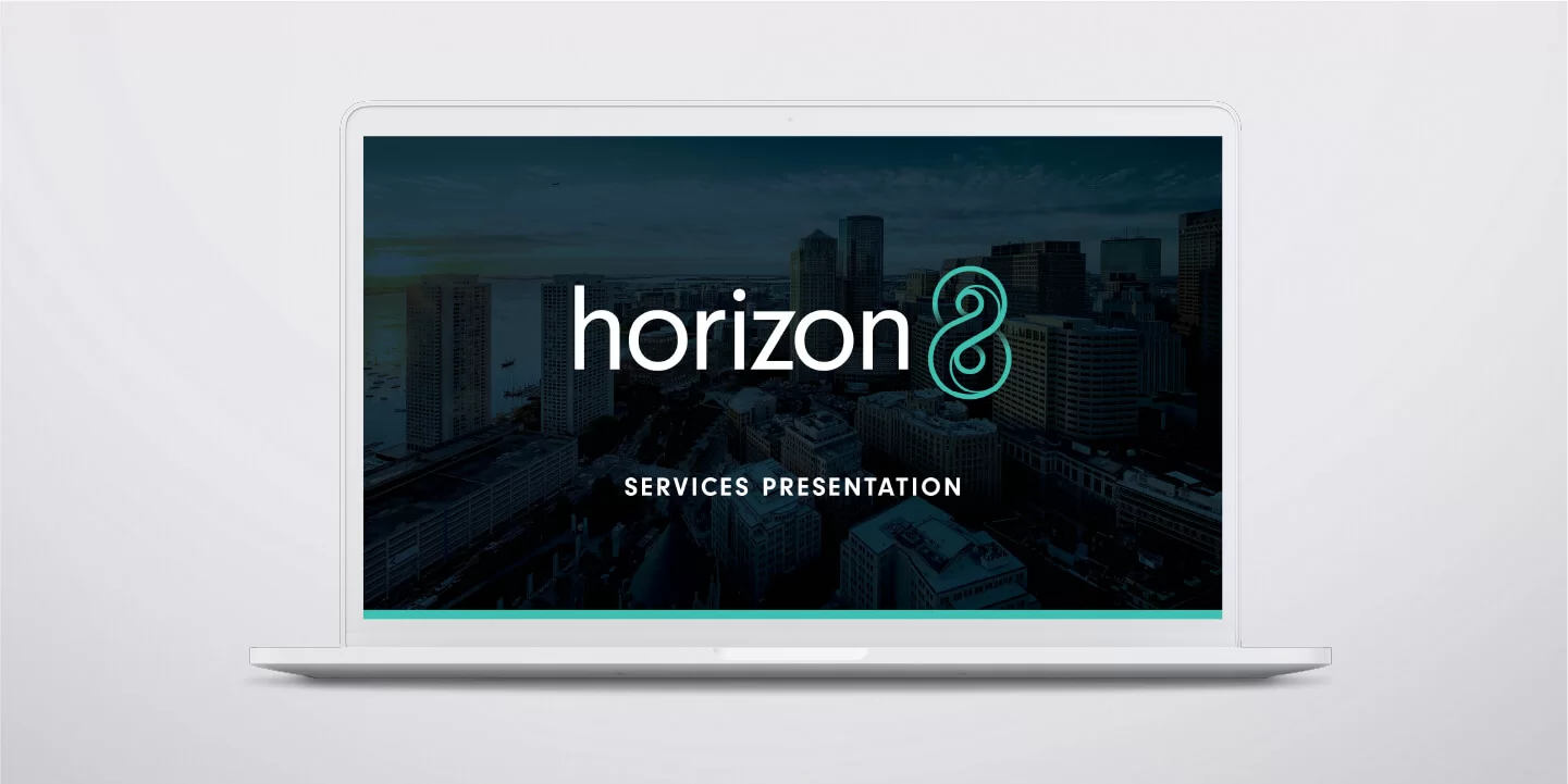
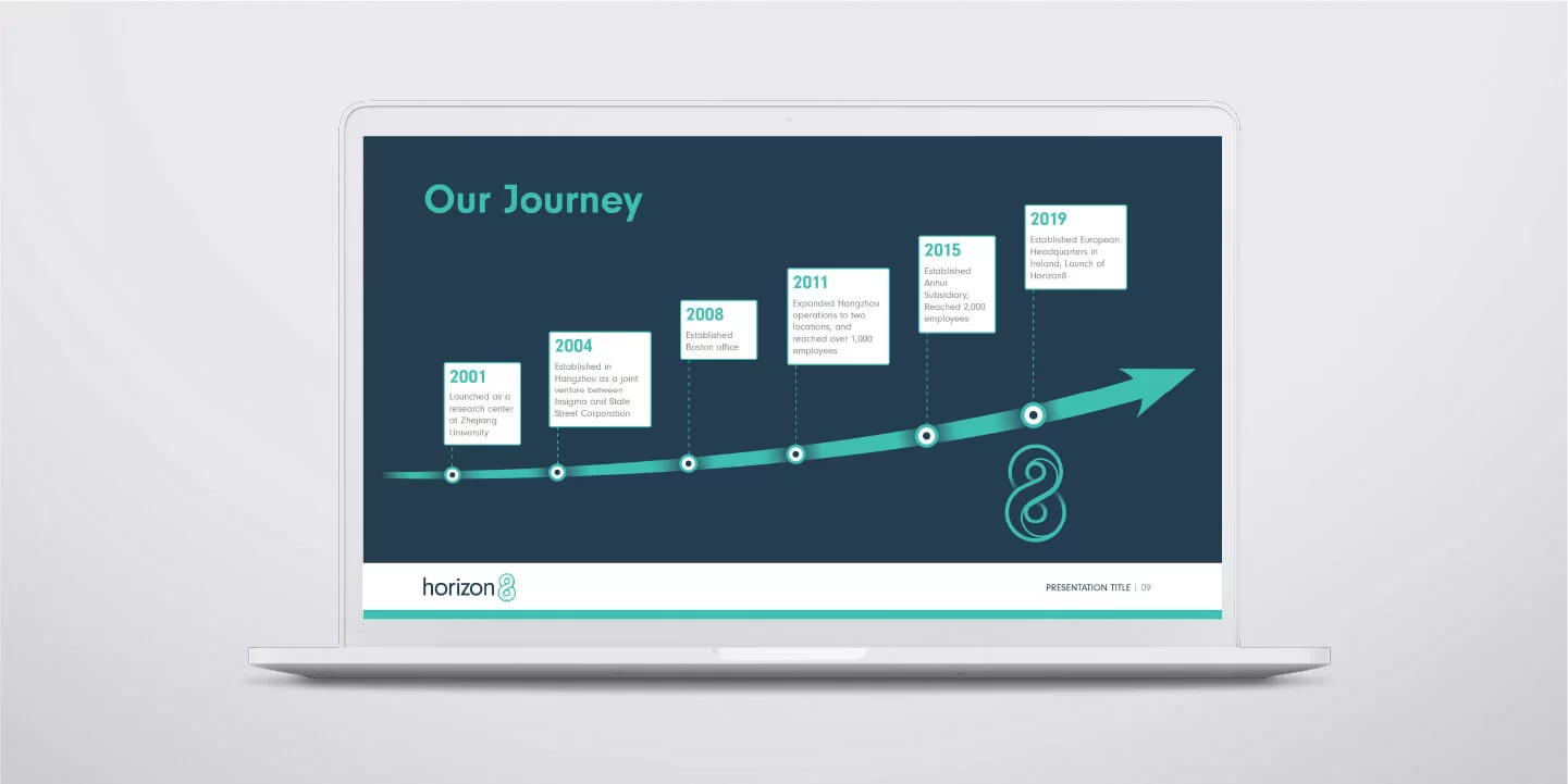
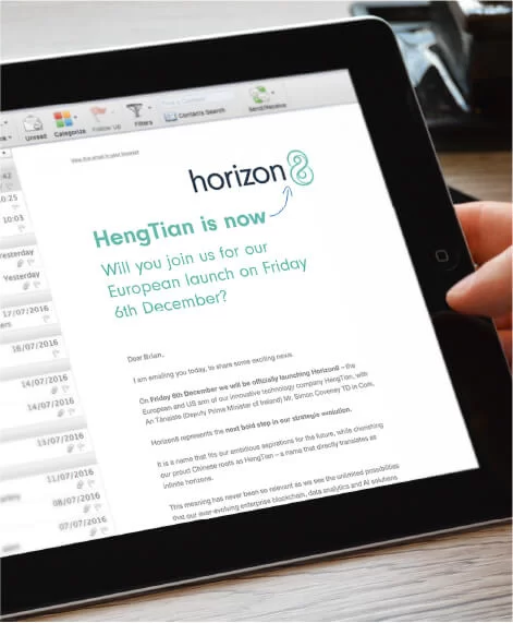
We took away a clear brief from our session with HengTian and started our own internal creative brainstorm. We knew the name needed to be easy to pronounce, have an available .com domain and communicate the infinite possibilities their innovative technology solutions could provide. But they were also immensely proud of their Chinese roots and it was that history and proven track record, that would form the cornerstone to building trust and credibility in these new markets.

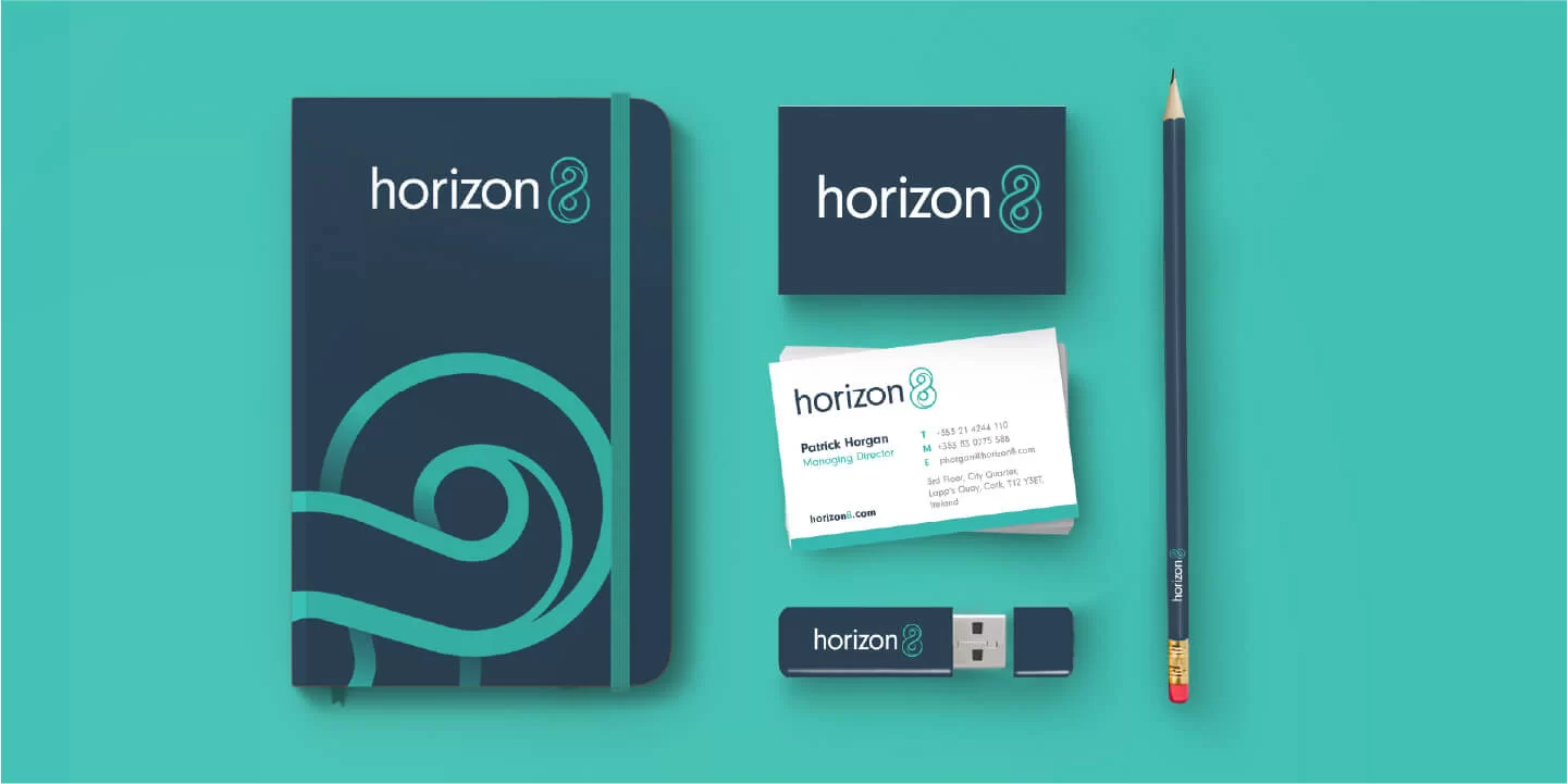
And so, the name Horizon8 emerged – inspired by the current name which directly translates as infinite horizons, with the figure 8 as a symbol of that infinity.

Empower

With this new name, came the creation of a new brand identity. A logo was developed featuring a monogram of the figure 8 which forms part of the company name. The symbol loops infinitely around on itself, with an inner line to give added uniqueness, movement and depth to the graphic. It was paired with an all lowercase sans serif font which anchors the swirling 8. A teal green was chosen to complement the corporate navy and dierentiate it from competitor colour schemes.

Finally, we empowered the team with a suite of launch communication creatives to allow them to unveil this powerful new Horizon8 brand identity with a splash. And we set them up to move forward in these new global markets with confidence.
View Cork Portfolio

Let’s work together.

Contact Us
White arrow right
The Brewery, Fairlane, Dungarvan, Co. Waterford, X35R672. Ireland.
View Google Map
City Quarter, Lapps Quay, Cork, T12 Y3ET, Ireland.
Contact Cork
3015 Lake Drive, Citywest, Dublin, D24 DKP4, Ireland.
Contact Dublin