Stock images versus commissioned photography for your web design.
The decision between stock photography and commissioned brand photography is a crucial one for your web design. The imagery you use is such an essential part of communicating your visual tone of voice and your overall brand personality.
The following are three key questions to ask yourself;
1. Do you have the time to wait?
Good things come to those who wait. But if time is tight and your deadline is yesterday, commissioned photography unfortunately, just simply may not be an option. If that is the case, stock libraries like Shutterstock, I-stock, Getty Images and Adobe Stock can save the day. They offer easily searchable online databases, with diverse high-quality images that are downloadable for immediate use. Then and there.
2. Can you afford to do it?
One of the key advantages of stock photography can be price. Commissioning brand photography can be a little more expensive for organisations. When this is the case, you need to look at a way to balance brand and budget needs. We sometimes commission photography for a handful of lead shots for clients in these cases, so that we have some key, unique and ownable images that really communicate the brand essence. And then we support those with secondary stock images in less prominent spots of the web design.
3. Can you afford not to do it?
What is your brand’s unique selling point? There are situations where stock photos just won’t cut it in communicating it. And actually, to use anything other than unique and authentic shots in the final web designs could be brand damaging.
Below are three examples of client projects, where because of the brand promise and unique proposition we were trying to communicate with the imagery, they couldn’t afford not to commission professional photography.

Creating a brand and web design that stands apart.
We worked with Cliff to refresh their brand identity and to design a new group website CLIFF.ie.
In a world of me-toos, chains and clones, Cliff stands apart. It is a capsule collection of privately-owned venues and rendezvous’ that conspire to create something truly unique. Cliff thinks differently and does things a little differently too – seamlessly combining imagination, innovation and an adventurous spirit with an eye for detail. All whilst adding a little magic along the way too.
For the new Cliff brand, it was critical that the visual and verbal tone of voice of the web design communicated this. It had to ‘show’ not ‘tell’ Cliff’s unique personality – how it celebrated the eclectic, the enigmatic and even the slightly eccentric. That simply couldn’t be done through stock photography. When the essence, the core of your brand, is the unique imprint it leaves – that can’t be communicated with generic shots.
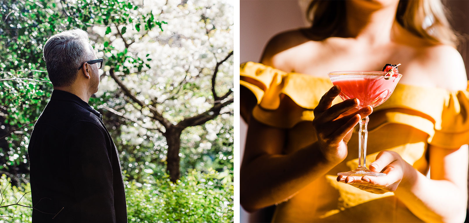
Instead, we commissioned an entire bank of bespoke photography from Shane O’Neill at Aspect Photography – over four different shoots and across multiple locations. Every shot had to be non-traditional and unexpected – breaking from the recognised industry standard. We wanted to interrupt and engage. When people looked at an image, we wanted them to feel the relief of letting go, the liberation of escaping their lives for a few days, to hear the sound of toast glasses clinking, imagine savouring the taste of something exquisite and unexpected… and best of all, imagining bringing a bit of all that magic home with them.
The result was the incredibly bold and striking visuals that first greet you when you visit Cliff.ie. And a brand-led web design that we truly do feel, stands apart.

Web designs that harness the power of people.
Cross Electrical were an amazing company, who’d gone through rapid growth largely driven by high-end referrals and word of mouth. But they now needed their brand to catch up and a professional identity and
When we looked at simplifying what made them unique, what their brand essence was, one thing emerged – “our power is our people”. And when it came to bringing that to life in a fresh new web design and across various marketing collateral, one thing became clear – we simply couldn’t afford not to commission photography.
For a company whose unique selling point was its people, we couldn’t show generic stock shots – we had to feature actual Cross Electrical staff, in action. We selected another one of the photographers we work with, who captured a series of authentic, high-quality, almost reportage style shots of Cross Electricals’ people – showing the quality and attention to detail they put into everything they do.
The result was a professional and engaging new brand identity and brand-led new web design that equipped this exceptional company to continue to scale at pace into the future.
Propelling success to the next level by adding video too.
One of our most recent web design projects for Eurofins Professional Scientific Services (PPS) was a particularly interesting one and one we are very proud of. It involved creating a whole new independent website for the Eurofins PPS business unit, that had previously had their online presence buried deep within the overall Eurofins site. And empowering this unit, that provides in-sourcing solutions to life science organisations, with the ability to directly engage with prospective clients and attract new hires across Europe.
Core to the ultimate success of the project was the approach the web design process took to the visuals. Our goal with the new site was to empower Eurofins PPS to appeal to and connect with its target audiences across Europe. And ultimately what connects people? People. So similar to our approach with Cross Electrical, rather than using actors, to make the web design truly connect we instead decided to feature the real Eurofins PPS teams. We shot on location in Cork and Dungarvan capturing real people in their real work settings.
The authenticity of these behind-the-scenes visuals was further reinforced across the web design with a series of videos commissioned – giving voices to the faces featured and allowing the Eurofins PPS audiences hear the real stories of the people behind the roles, first-hand. Their backgrounds, qualifications, experiences and most importantly, personalities.
The powerful new website, with its authentic approach to brand visuals, is already propelling the unit towards greater growth and success across Europe.
So, how do you select the right imagery for your web design?
At TOTEM choosing the right imagery for your web design and choosing the right imagery for your brand are one in the same thing. You must have a consistent visual tone of voice that seamlessly connects online and offline experiences of the brand.
So the three-step process we follow always begins with brand and understanding what the essence of yours is …
Simplify
We first make sure we understand what makes your brand unique and what it uniquely offers customers. If you don’t know yourself, that’s okay. Through brand workshops we can help you find the answer. And together, we can figure out your brand’s why and its unique position in the market.
Create
We’ll then start bringing your brand to life, creating mood boards of the types of images that communicate your personality and connect and create the right gut feeling with your audience. From that, we’d produce a detailed photography brief and shot list for any commissioned photographs that are required for your web design. And finally, with a TOTEM or external photographer, we’ll arrange the actual shoot and capture of a suite of brand imagery that tells your story.
Empower
We’ll empower you with the practical visual tone of voice guidelines and style guide to ensure that you continue to tell your unique brand story with the right images, that evoke the right emotions across all channels and media. Online and off.
While time and budgets may not make commissioning brand photography for every web design project a realistic option – and some supporting stock photography can be incredibly useful and effective – at a minimum we encourage our clients to commission a few iconic shots that capture and communicate their unique personality. Something that only your brand can own.
It’s such an essential part of your brand’s visual tone of voice, and your overall brand’s identity.


